A website ordering system gives customers a direct route from search, social media, packaging or a saved bookmark to the menu. Its value is not that it is automatically cheaper than every alternative. Its value is that the takeaway can design the journey around its own menu, capacity and service model. That control is useful only when the business also takes responsibility for traffic, maintenance and support.
When a website is the sensible direct channel
A website normally works well as the first owned channel when customers already know the business or can discover it through local search, social media, printed material or passing trade. It removes the installation step of an app and can serve both first-time and repeat customers from a normal web link.
A website may be sufficient when:
- customers can reorder quickly without installing software;
- the mobile experience supports the full menu and checkout;
- the business does not yet have a proven case for app-only retention features;
- local promotion can generate enough direct visits;
- staff can maintain prices, availability and opening hours;
- the ordering page integrates with, or is operationally compatible with, the kitchen.
An app can still become useful later, but it should solve a demonstrated repeat-ordering problem rather than serve as a badge of modernity.
Choose the operating model, not only the page design
Website ordering can be supplied in several ways: a hosted ordering page linked from the main site, a white-label platform using the business's branding, a plugin or module inside a content-management system, or a custom application. The visual difference may be small, while the operational and commercial difference is substantial.
| Area | What to confirm |
|---|---|
| Menu ownership | Where items, prices, modifiers and availability are maintained |
| Order routing | Whether orders enter the POS/KDS or require a separate tablet, printer or manual entry |
| Payments | Who processes the payment, when funds are paid out and how refunds appear |
| Customer information | What the business receives, how it can be exported and which uses are permitted |
| Support | How urgent incidents are handled during evening and weekend service |
| Exit | What happens to the domain, menu, data and integrations if the supplier changes |
Design the mobile journey first
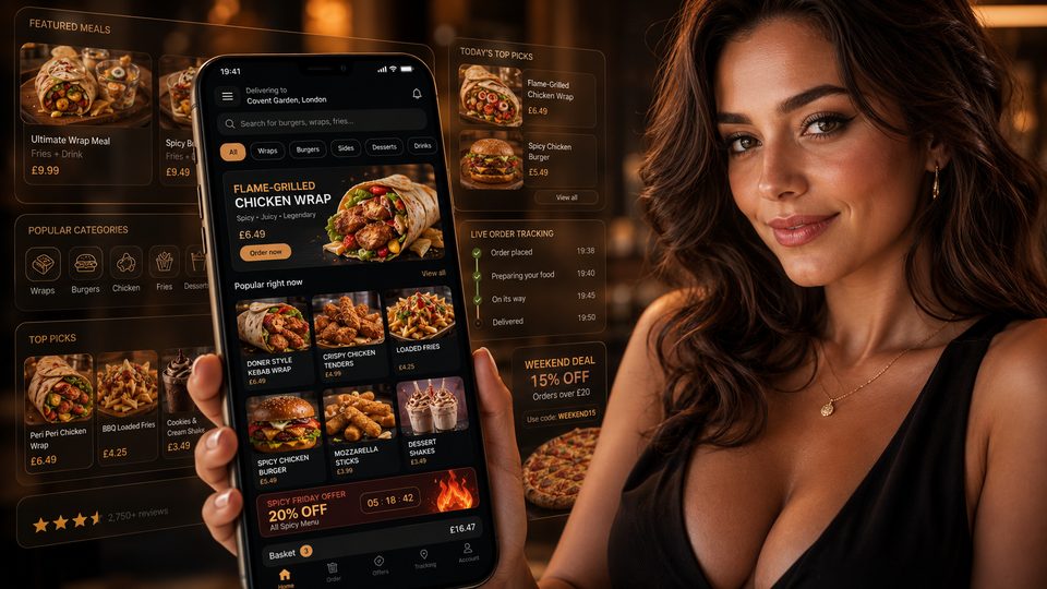
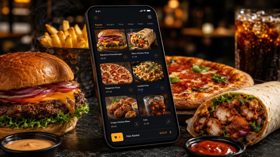
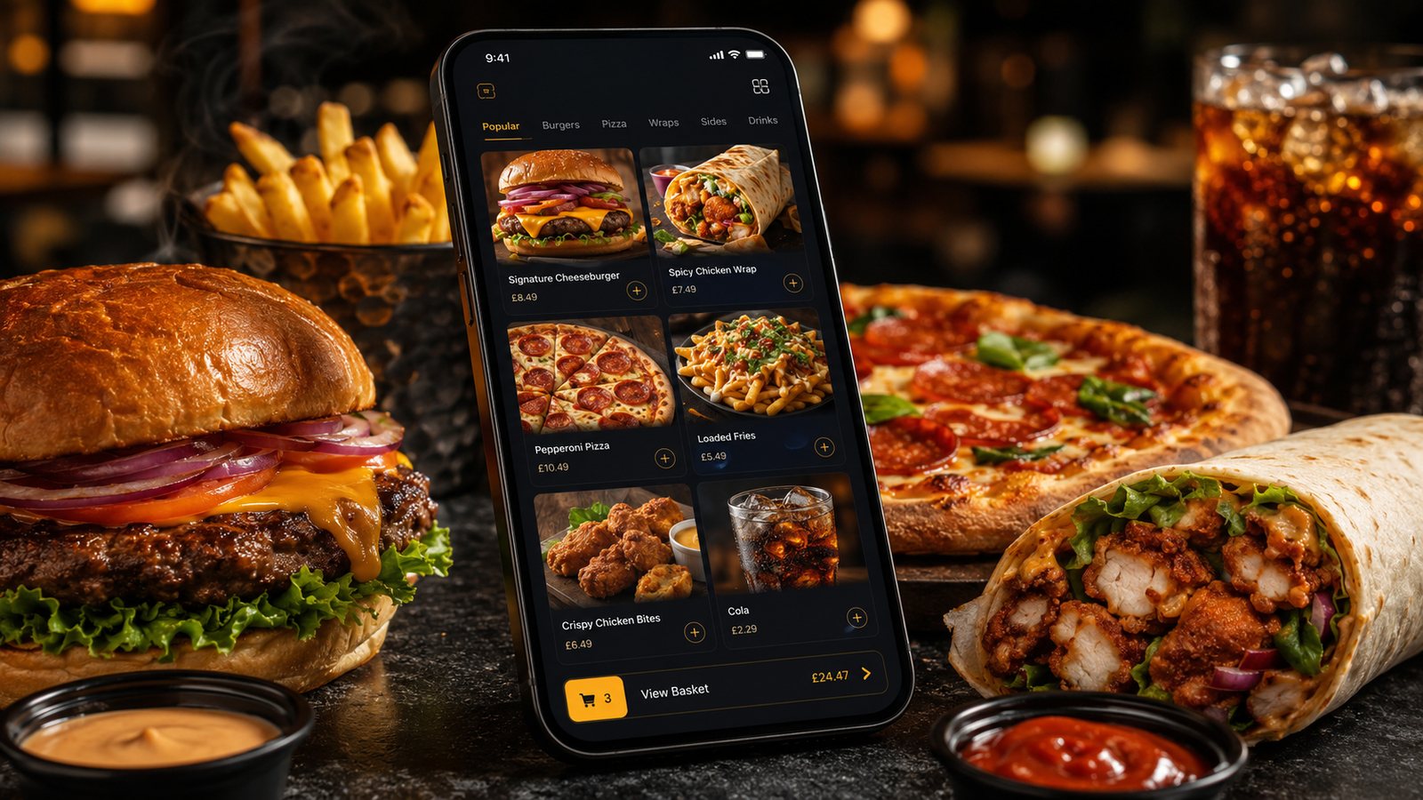
Most ordering sessions should be tested on a phone before desktop polish is considered complete. A customer needs to move from the landing page to a category, item, basket and payment without losing their place or repeatedly closing overlays.
The interface should provide:
- clear delivery and collection availability;
- opening status and the next available ordering time;
- fast category navigation;
- large, readable item controls;
- visible price changes for modifiers;
- a persistent route to the basket;
- useful error messages that preserve entered information;
- a checkout that does not require unnecessary account creation.
Performance matters because menu pages often contain many images and options. Use appropriately sized images, avoid loading media that the customer has not reached and test on an ordinary mobile connection, not only fast office Wi-Fi.
Make the menu match the kitchen
The website menu should be easy for a customer to understand and easy for the kitchen to execute. Category labels can reflect customer language, while item names and modifier outputs should remain recognisable on the ticket or screen.
Every online choice needs a valid kitchen outcome. Prevent impossible combinations, show mandatory selections clearly and avoid offering a free-text box as the primary method for routine customisation. Check that sold-out changes reach the website quickly and that somebody verifies the customer-facing result after an update.
Build collection and delivery as separate promises
Collection and delivery have different capacity constraints. Collection depends on kitchen output and a workable handover point. Delivery also depends on packing, driver availability, travel and the size of the service area.
The website should therefore support separate time estimates, minimum orders, fees, zones and pause controls. A customer should understand the available option and total price before payment. Do not reveal unavoidable charges only at the final step.
Use checkout to confirm, not surprise
The basket should summarise items, quantities, modifiers, charges, address or collection details and the expected time. Allow the customer to correct obvious mistakes without rebuilding the order.
Guest checkout is normally appropriate for a first order. Account creation, saved cards or loyalty enrolment can be offered after the essential transaction is complete or as a clearly optional step. Marketing consent should be separate from service messages such as receipts and order updates.
Connect the website to a capacity process
A website can generate demand faster than a telephone line because customers order in parallel. Staff need direct control over preparation times, order limits and temporary pauses. If changing capacity requires contacting the supplier, confirm how quickly that can happen during a live service.
Capacity should be based on the constrained station or resource, not a generic order count. A kitchen may handle several simple orders but struggle with the same number of large, heavily modified orders. Where possible, test item- or workload-based controls rather than relying only on a fixed number of baskets.
Plan for failures and corrections
Before launch, test:
- payment accepted but order not received;
- duplicate submission after a slow screen;
- printer or tablet offline;
- item unavailable after payment;
- customer changes the order;
- partial and full refunds;
- delivery address outside the zone;
- website unavailable while the kitchen remains open.
The fallback should explain how staff verify the payment, contact the customer, route the corrected order and reconcile the adjustment later.
Measure whether the website is improving the business
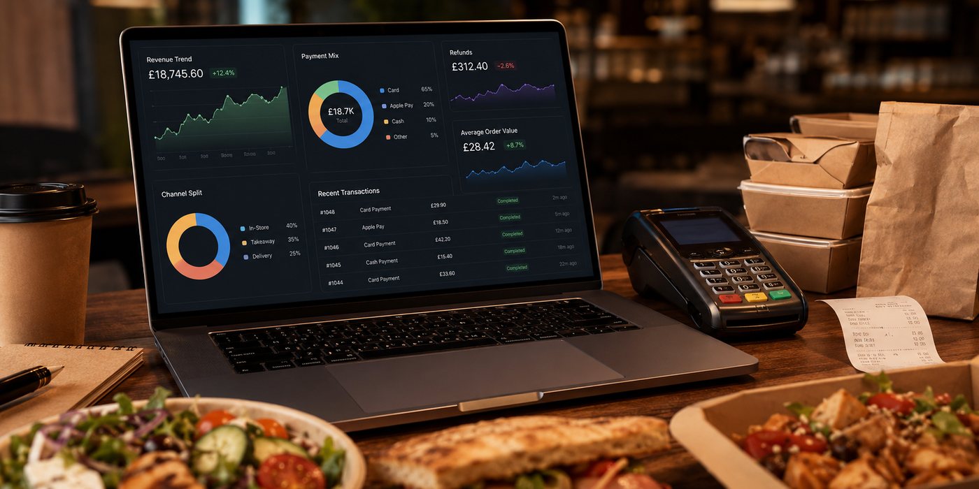
Traffic and conversion are useful, but operational outcomes determine whether the channel is sustainable.
- direct orders and repeat use;
- contribution after payment, software, promotion and support costs;
- promised versus actual completion time;
- menu, modifier and address errors;
- refunds, cancellations and remakes;
- abandoned baskets by checkout stage;
- staff time spent correcting and reconciling orders;
- incidents and supplier response.
A successful ordering website is not merely a digital menu. It is a controlled route from customer choice to kitchen execution and payment reconciliation.
Related guides
- Online Ordering — the main guide for the wider topic.
- Collection and Click-and-Collect Setup — a detailed next step for putting this guidance into practice.
- How to Design Checkout for Takeaway — a detailed next step for putting this guidance into practice.
- Owned Channels vs Marketplaces — a closely related operational control to review alongside this page.
- Getting Started with Online Ordering — a closely related operational control to review alongside this page.
- Restaurant Apps — a connected decision that can change the recommended approach.
Official guidance checked
- Competition and Markets Authority: Providing clear and accurate information about prices
- Food Standards Agency: Distance selling and pre-ordering allergen information
- Information Commissioner's Office: Privacy notices and cookies
- Information Commissioner's Office: Plan direct marketing
Guidance checked: 24 July 2026. Confirm supplier functions, payment responsibilities and data-export terms against the current contract.